SpheraCloud: Usability Evaluation
Identifying Areas for Opportunity

Keeping Workers Safe
Sphera is an environmental, health and safety company that provides incident tracking, emissions compliance and risk assessment software to the leading oil and gas companies in the world. Sphera had historically created large on-prem enterprise software solutions but realized they needed a more lightweight SaaS product to stay competitive. SpheraCloud was designed to report incidents and create processes that prevent injuries.
I joined a team of 5 developer/designers 3 weeks prior to the release of Sphera’s first SaaS product, SpheraCloud.
My Role
I was brought on to:
Evaluate the usability of the product
Refine the personas used for feature prioritization and
Help to design UI elements and refine workflows
One of the first challenges I tackled was to identify areas for improvement within the UI to improve usability as early as possible.

Usability Evaluation
Because the product was already fully designed and developed when I joined, I conducted a usability evaluation of the SpheraCloud SaaS product using Nielson’s 10 usability hueristics to identify the following areas of improvement:
• Search
Search tools and results needed significant improvement.
• Inconsistent UI Elements
Certain UI elements were used for many different purposes which made for an unpredictable experience.
• Poor At a Glance Visibility
Incident reporting progress and assessment completion status were only viewable in details page.
• Lack of Editing Capability
No way to delete items such as tags, statuses, reports, etc in the system once created.
Designing for Environmental, Health and Safety
Environmental, Health, and Safety Managers - the main users of our web app - need to report incidents to OSHA (the Occupational Safety and Health Administration) and perform regular assessments of the operation processes. Reporting an incident requires the user(s) to complete a series of steps in order to be submitted to OSHA. These steps can be performed by different individuals at a company or all by the same individual depending on the size of the environmental, health and safety team.
Submitting an incident to OSHA involves dealing with extremely sensitive personal information and often very tight deadlines (there is a time requirement to submitting severe incidents to OSHA). Because of this, the system needed to have an emphasis on security as well as allowing the user to make extremely quick judgements.
Search Results
SpheraCloud was meant to handle thousands of incident and near miss reports. However, if a user was looking for something in particular, they might turn to the search bar to jog their memory. Our search functionality needed to be vastly improved in order to be usable to EHS managers looking to pull up information quickly.
The search bar provided a search overlay which would provide a short list of relevant results. If one didn’t see their desired result there, they would click through to the full search results page.
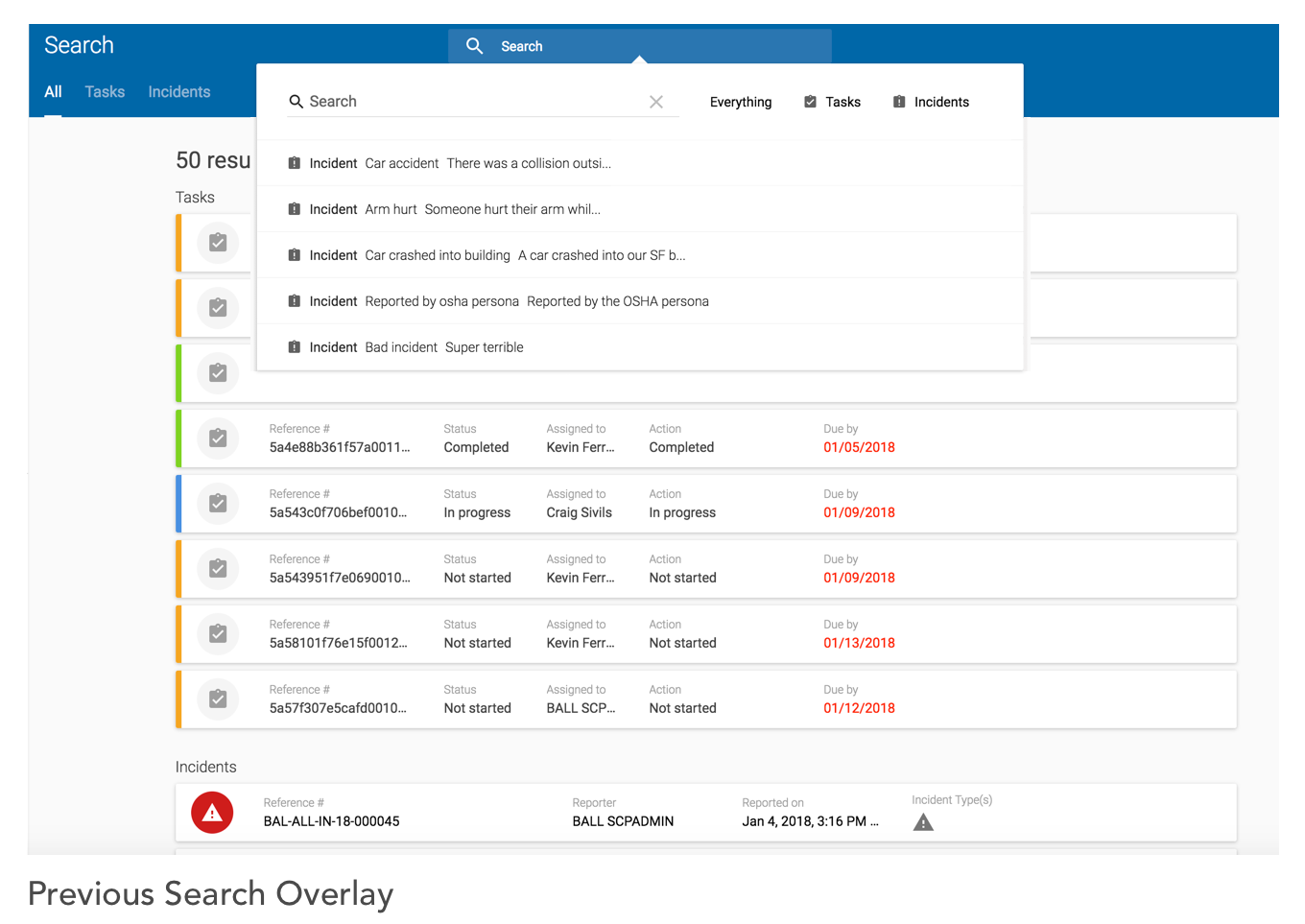
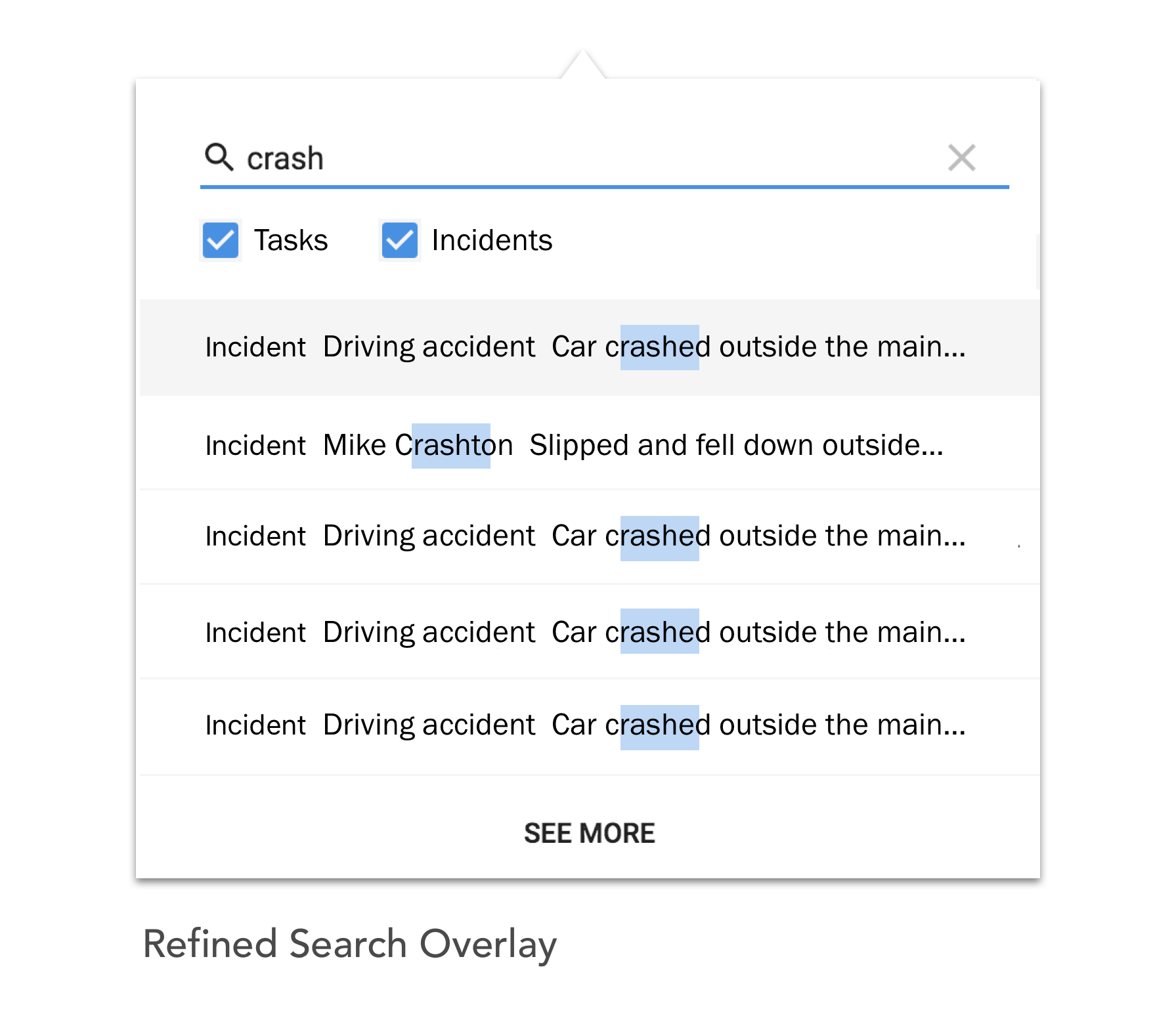
Search Overlay Suggested Improvements:
• Highlight relevant search terms in the results so users can quickly recognize the result they’re looking for
• Align the results to the width of the overlay to show more information and use white space more efficiently
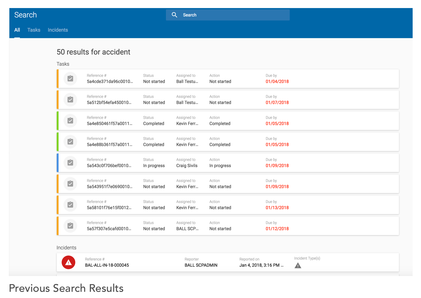
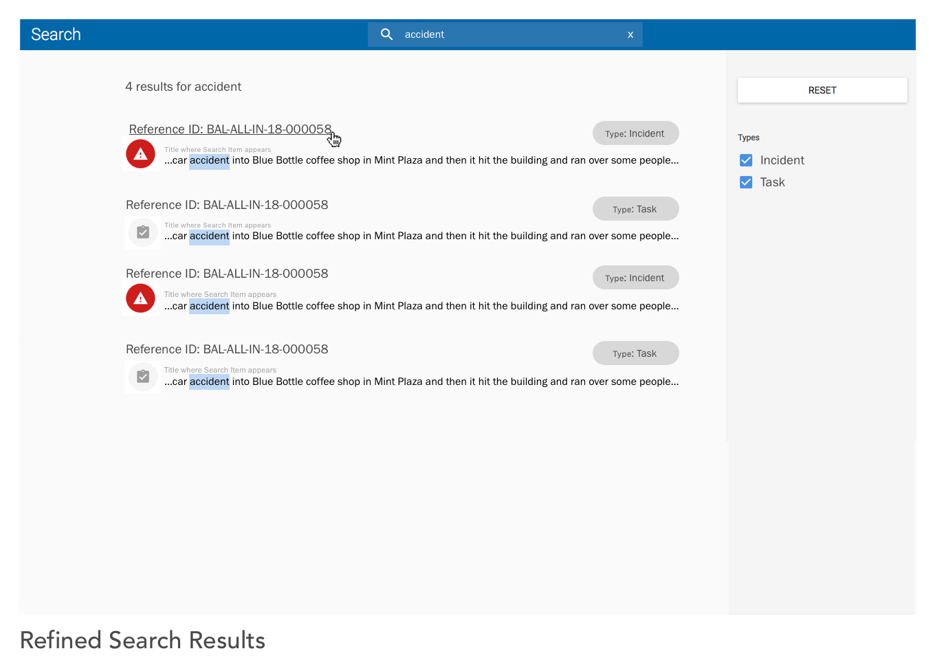
Full Search Results Suggested Improvements:
• Show only relevant results, sorted my highest relevance first
• Allow for quick recognition by giving textual context before and after the search term appears in the result
• Allow for quick type filtering on the side panel
Smoothing Out Inconsistencies
Problem: A lack of consistency meant that different elements of the system behaved differently depending on where one was in the system. Moreover, there were multiple patterns to initiate the same behavior in the system.
Solution: We wanted to achieve a more cohesive experience by smoothing out these inconsistencies.
To start, we focused on the behavior of when someone creates a new item in the system, be it a project, team, form configuration or assessment type.
When a user tries to create a new entity, the behavior is different depending on what they are creating. Moreover, sometimes they just created empty content.
Example of a user creating a new form that contains no content:

We reworked the flow to create a stepped process, educating users on the system set up through progressive disclosure. As the user creates a new entity in the system, they understand where what they are creating fits and how it is related to the other entities. This was a challenging decision to make in that it actually lengthens the process to create content. But ultimately we made the decision to create content this way because it strengthened the user’s mental model of the system, teaching and reinforcing how the system is set up.


Increasing Transparency
The steps for submitting an incident after it was reported are:
1. Verify Incident
2. Assign tasks to the team to collect medical information and assess damage
3. Submit the appropriate OSHA requirements
4. Review everything before submission
However, the only way to start verifying an incident was to initiate it from the Incident Details page, hidden behind many clicks as seen below:

Moreover, the only way to identify from the list that you had the incident that you were looking for was if you’d memorized the Reference # (something people rarely did). You had to click through to the inspector panel to see more details about the incident and then click further into the details page in order to take action on the incident itself.
Incident List suggested improvements:
• Allow users to see from the list view where they were in the process and take action.
• Have a master-detail relationship with the list view to let users get a lot more detail from the individual list item without leaving the incident management page.