CloudApp
Share Page Redesign
Problem
CloudApp, a content sharing service, would like to increase the sign ups and account creation from its highest trafficked page, the Drop Viewer page. However, since this is a productivity application, we can not obscure or interfere with any of the shared content which could be large screenshots or videos.
Deliverables
User Research Insights, Persona, Wireframes, Educational Animation, Interactive Prototype
Role & Duration
2 person design team, 2.5 weeks
User Research
We conducted user interviews with both super users and non-users to find a way to bridge the gap between the groups and highlight the benefits of using CloudApp. We then did affinity mapping to uncover the biggest pain points for new users viewing the drop viewer page for the first time.
Key Insights
From our research, we created a strategy to increase user signups by providing context for new users. We targeted users who are already sharing large amounts of content such as screencaps as part of their daily workflow. To provide context, we would need to create the following experience:
Orient the user. When first arriving on the page, many people do not know that they are viewing a page associated with CloudApp. We need to bring brand visibility to the page and establish trust with the user.
Intrigue the user to learn a little more about CloudApp. Show them that this is an application to download.
Educate them on the benefits of CloudApp by and showing how easy it is to use.
Persona
Bar Redesign
When sharing content with CloudApp, the user
Paper Prototype
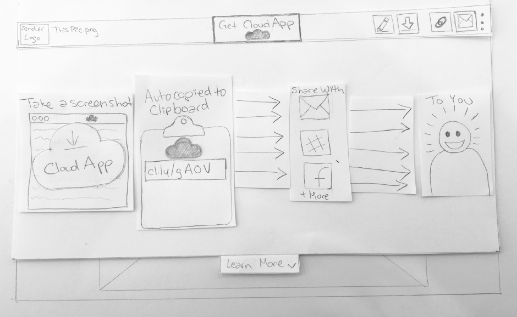
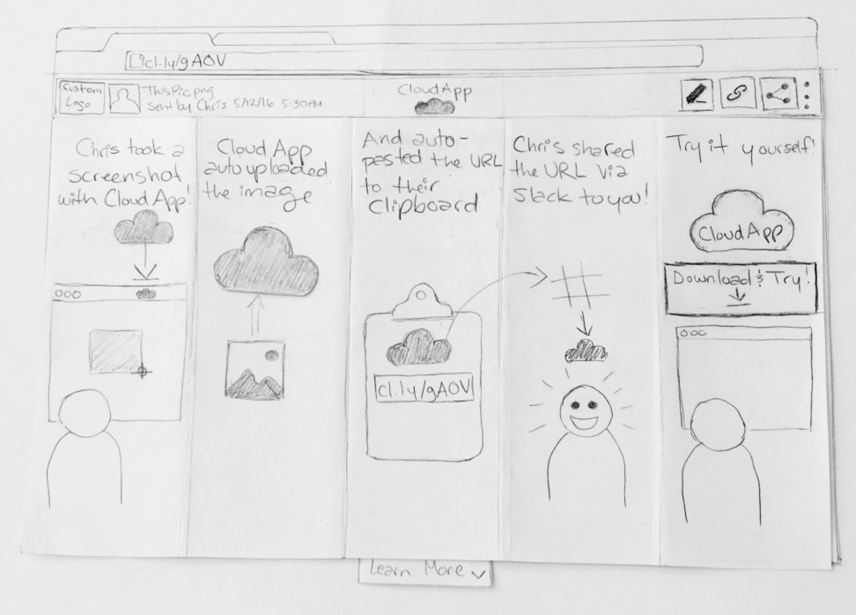
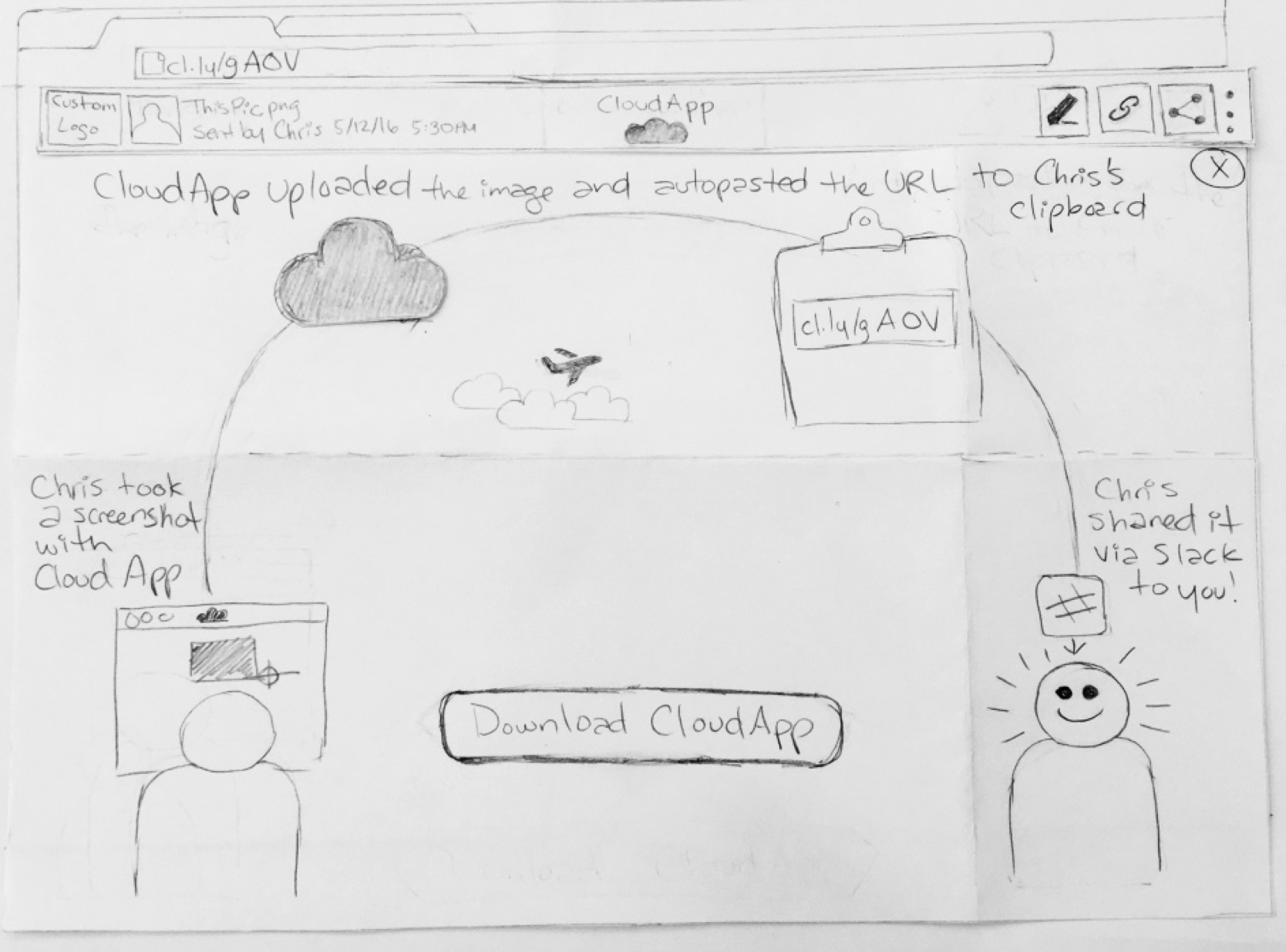
After discussing with the stakeholders, we decided to focus the project on testing the educational narrative to show users the benefits of using CloudApp. Once we focused the project on the educational narrative, we tested out a paper prototype of the animation first.


Educational Animation - 3 Variations
After testing and refining 3 versions of the paper prototype based on user feedback, we decided to create and test a more high fidelity version of the animation. We created 3 different ways to display the educational content.
Next Steps
A/B test on icons on the drop bar
Usability testing on educational CTA tab placement
Testing different animation narratives for the educational drawer
Usability testing on education tab CTA text


