Blue Shield of California
Find a Doctor: Integrating alternate care access routes
Helping users choose how they want to access care
Blue Shield of California’s Find a Doctor feature is one of the most used features across the member portal. This project began as a smaller project to incorporate telehealth visits into the find a doctor search results and ended up as a new step to the find a doctor flow which allowed users to choose how they wanted to access care.
My Role
I worked on a two-person strategy team and created the designs for all responsive sizes and platforms.
Deliverables:
Initial exploratory mockups
Paper prototype for in-person usability testing
Interactive prototype for remote user testing
High fidelity mockups for responsive web and mobile
A simple request
This project began as a simple ask to add Teladoc (a telehealth service) into the find a doctor search results. Teladoc is widely underutilized and users may be missing a valuable resource for receiving quick care instead of going to urgent care (a much more time intensive and costly option).
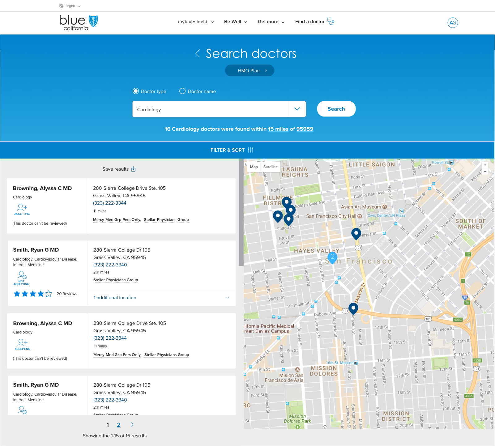
Existing Find a Doctor Flow
Finding a doctor consisted of 3 steps that would end in a results list page.
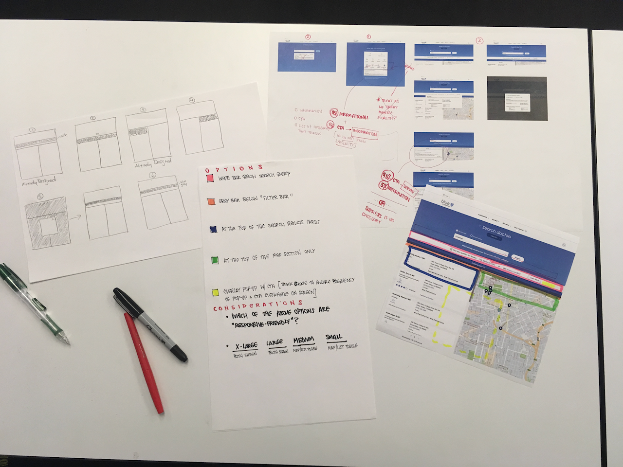
Initial mockups round 1
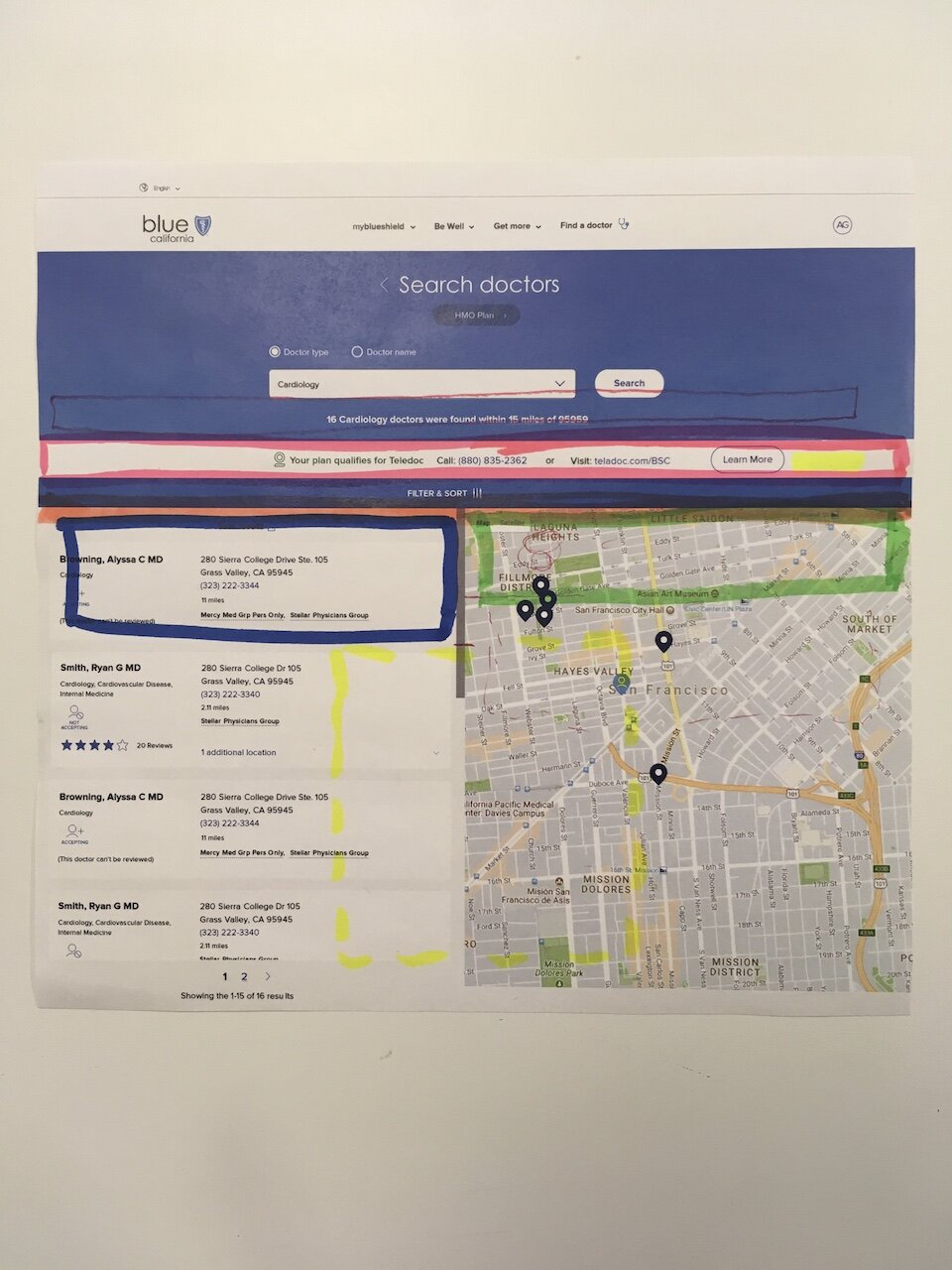
Because there was very limited space on the search results page, I experimented with placement options.
Paper Prototype Usability Testing Round 1
I printed out the placement options and the team did a round of usability testing. The results were overwhelmingly negative. Feedback included:
“This feels like an ad”
“Why are you pushing this service on me”
“I would be furious if you showed this to me when I’m trying to get to the doctor search results”
Revision Round 2
Taking the feedback we received, we experimented with surfacing the choice sooner in the process to educate users on what Teladoc was before showing the option to them in the search results.
Paper Prototype Usability Testing Round 2
We tested this round of educational designs to try and let users know beforehand that they had this benefit available to them. Again, the feedback was negative, and most people didn’t see the additional informational boxes at all. However, those who saw the informational boxes earlier were markedly less frustrated by seeing the information surfaced again in the search results.
Research Insights
We concluded from the rounds of testing that surfacing Teladoc as an addition benefit around the existing find a doctor design was not resonating with users at all as they saw it as an advertisement. What we needed to do was to surface it earlier in the flow but also embed it within the choices as an equal partner.
1st version of the choice screen (Revision 3)
The first version of the choice screen was created. We initially debated where to surface this within the flow but decided it would work best after a user had chosen a specialty as Teladoc was only available for certain specialities and we didn’t want to falsely mislead users into thinking Teladoc was available for every option within a category. However, making a large change to the find a doctor flow required more stakeholder buy-in. We needed more data to back up our suggestions.
Paper Prototype Usability Testing Round 3
We performed another round of usability testing and showed the the initial paper prototype versus the revised flow with the choice screen. We alternated between which paper prototype we led with to reduce bias towards one or the other. Findings included:
The choice screen flow was overwhelmingly favored as both informational and reduced the frustration a lot of users felt when seeing the previous versions.
The page surfaced a larger need to integrate additional access routes in the find a doctor flow. This way, we would be able to add more access routes as they became integrated with our system.
Users did not mind having an additional click as long as they felt they were getting closer to the care they needed and wanted.
Interactive prototype for remote user testing
After altering the design to fit more seamlessly with the visual design of the rest of the find a doctor flow, we did a round of remote unmoderated usability testing on an interactive prototype to understand content and layout preferences.
Note if the prototype below doesn’t load (known issue with iframe, third party cookies and chrome), please use this link: Find a Doctor Interactive Prototype
The prototype above very closely follows what is currently in production (barring small content tweaks). This fork screen launched October 4th, 2019.


