Blue Shield of California
Component Library
Streamlining Design Creation
When I joined Blue Shield, I joined a small design team in the process of growing rapidly. The current designers, by and large, worked separately and in different tools (XD and Sketch). There was an engineering component style guide but none of the components had been standardized across designers. We began a very large design system initiative to audit and catalog each of our components to bridge the gap between engineering and design but we also realized that we needed a solution sooner that would bring all the designers on our team together.
My Role
I was the sole creator of the shared component library for desktop and mobile.
The (Immediate) Problem
While it’s often best practice to create the design system as one is creating the initial design (or the initial redesign), many times the need for a design system comes after acknowledging that the current system is unsustainable and won’t be able to scale easily. We needed the design team to be brought into alignment before we would be able to align across all teams including engineering and product.
We were faced with a choice - Wait for the full design system initiative to be complete in order to deploy the component library (an initiative we knew would need significant time to do right) or build a component library now with the knowledge that the larger audit/component redesign would impact the component library. Given how fast our design team was growing, we made the decision to go the latter route - create the component library now as part of the larger design initiative.
The existing style guide had components but no guidelines on styling, nor did these elements exist in a single design file.
An example of the card component from the IT style guide

The Larger Problem
The component library was nestled in a much larger design system initiative. Early on, we realized we needed to audit our components for accessibility, consolidate our duplicate and one-off components, and redesign our components with a shared vocabulary across engineering and design. This larger initiative was going to be a huge overhaul for our overall design and engineering processes and was running parallel to the component library creation.
Adoption and Behavior Change
For some members of the team, using this component library was an introduction to shared libraries and easy adoption of the tool was contingent on reducing friction wherever possible. I had to answer the following questions:
What needs to be accounted for in the library? (One-off components should not be included and will be reduced with the component library)
How can I make the most flexible base components?
How much flexibility should each component have?
Some components do not change very much very often like the navigation. Is it better to lock these elements more without someone having to go through a lot of overrides?
When does flexibility slow you down?
How will people be using the library?
Are they creating new elements/pages or making tweaks to existing pages?
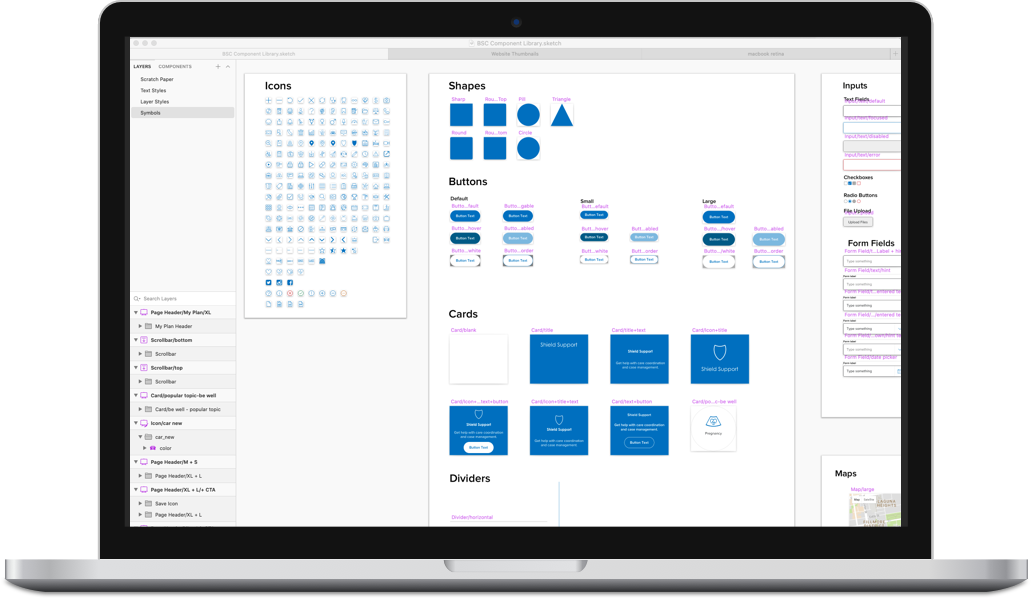
Starting at ‘Smaller than Atom’ Base Components

Brad Frost’s Atomic Design System Concept
I based the structure of the components on Brad Frost’s Atomic Design concept with a few tweaks.
I quickly realized that there was a layer below atoms for branding elements - global colors, shadows, typography, corner radiuses, etc.
I audited the member portal for:
Colors
Icons
Shadows
Shapes
and created a global color palette, layer styles and text styles to maximize component flexibility.
The color, layer style and text style collections


Organization & Information Architecture
Initial explorations of how the symbol menus would behave for layer styles

If a component library’s purpose is to bring order to the chaos of designs, how do you bring order to the chaos of the component library?
If there is one thing that will help to enforce good layer naming hygiene, it is creating a component library where layer name, layer order and artboard name are the only way to make each component usable for someone else.
Part of creating usable components is thinking through how someone will use the override panel. For this, I made sure to do the following:

An example of naming conventions I used
Make sure all of the layers are organized top to bottom in terms of component elements
Make sure each text layers is labeled with relevant titles for what they control
The hardest part for me to learn - It is ok to not allow overrides on every element. Sometimes reducing flexibility can reduce noise
Build it — Then build it again using as few elements as possible
I spent a lot of time building and rebuilding elements. I wanted to get customizing components down to the least amount of steps possible. This required experimenting both with the structure of the components, the level of possible customization for the symbols that would be needed and the number of steps to get to that customization.
To reduce friction, I focused on the following principles:
Make the base foundational elements as flexible as possible
Create new components instead of forcing people to sort through a million overrides - People detach symbols when they are not flexible enough to accommodate what one wants them to do but also detach when they’re too much trouble to wade through.
Don’t over-engineer components - the complexity of a component should never overshadow its ease of use
Building flexibility into a single blank card symbol

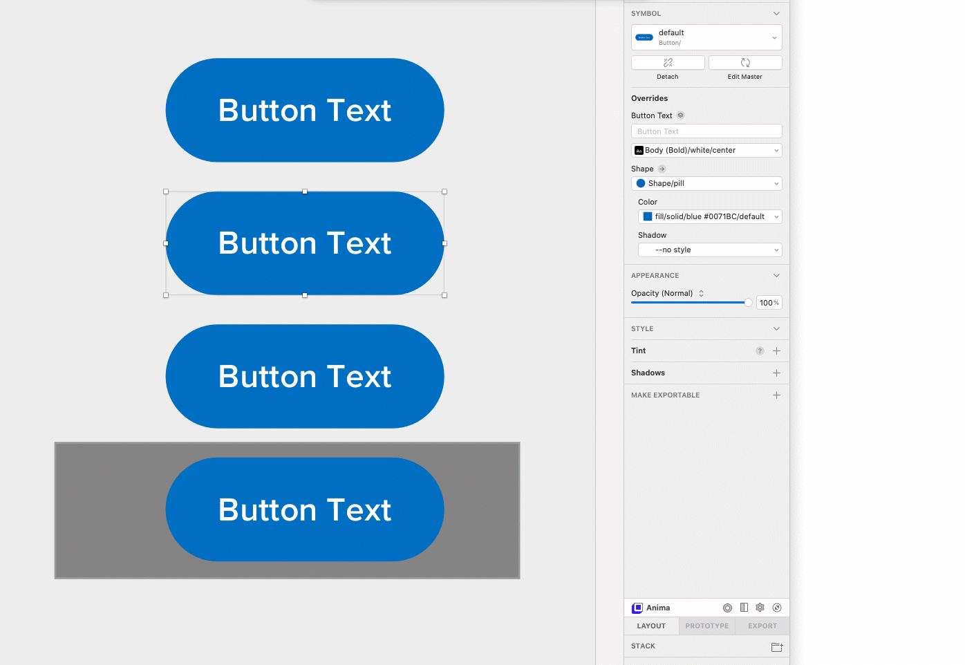
Button flexibility to demonstrate the different button states
An example of the configurability of a very commonly used card element

“Final” Outcome
Design systems and component libraries are never totally finished and should be living, breathing, ever changing organisms. I brought the component library to a foundational point where it was ready to deploy and continued to work and add to the library over the next weeks and months as we worked on the larger design system initiative.
I decided to make the components responsive where possible, and create components in additional sizes, where it made sense. Many of the hero pages (dashboard, all claims, etc) were rebuilt with the component library instead of added as a template to the library, since these pages were likely to be changed constantly.
